Shade Finder Makeup Balm Quiz Ad Template - Square
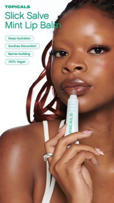
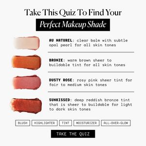
This square ad template promotes a complexion-makeup balm/tint range by turning shade selection into a quick “find your match” quiz. The design is clean and editorial: a white background, elegant high...
Free for 7 days — Cancel anytime
About This Template
This square ad template promotes a complexion-makeup balm/tint range by turning shade selection into a quick “find your match” quiz. The design is clean and editorial: a white background, elegant high-contrast serif headline, and a black highlight bar behind “Perfect Makeup Shade” to create instant hierarchy. Four real-looking swatches run down the left (pearl, bronze, dusty rose, and a deeper sunkissed tone), while the right column lists shade names in bold caps with typewriter-style descriptors and thin divider lines—making the range feel curated, inclusive, and easy to scan. Strategically, it’s built for TOF awareness with curiosity and personalization as the main triggers: the quiz promise reduces decision fatigue and invites low-commitment interaction. Aspiration is reinforced through the premium, magazine-like typography and the “all skin tones” messaging. Customize by swapping swatch photos to match your formulas, editing the shade descriptions to reflect undertone/coverage, and replacing the bottom feature chips (blush, highlighter, tint, moisturizer, all-over-glow) with your product benefits. The bold “TAKE THE QUIZ” button anchors the CTA without cluttering the layout.