Beauty Product Comparison Chart Ad Template - Square
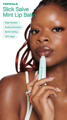
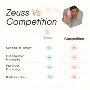
This square ad template is built for a beauty or skincare brand that wants to win consideration with a clear side‑by‑side comparison. The headline “Brand vs Competition” dominates the top left in a mo...
Free for 7 days — Cancel anytime
About This Template
This square ad template is built for a beauty or skincare brand that wants to win consideration with a clear side‑by‑side comparison. The headline “Brand vs Competition” dominates the top left in a modern sans‑serif, while a soft peach accent on “Vs” and a hand‑drawn arrow guides the eye toward a model holding the product in a clipped hexagon frame. The center features a taped “card” with a simple checklist table: benefit rows on the left and rounded “Yes/No” pills (green for your brand, red for competitors) to create instant visual proof. The off‑white background and generous spacing keep it clean and credible—ideal for audiences evaluating multiple options. Psychologically, the template leverages authority and clarity: certifications, regulated pharmacies, fast processing, and no hidden fees translate into trust signals at mid‑funnel. Customize by swapping the checklist rows for your differentiators, replacing the product photo, and aligning the accent color and pills to your brand palette while keeping the contrast that makes the comparison scannable.