Blue Light Glasses Us vs Them Ad Template - Story
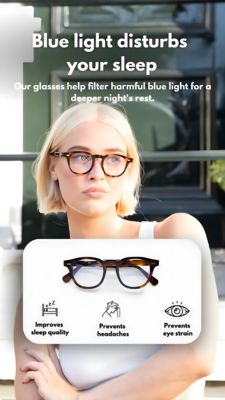
This Story-format comparison template is built to sell blue light blocking glasses by visually contrasting “US” vs “THEM.” The layout is split down the center with a bright cyan header on the left and...
Free for 7 days — Cancel anytime
About This Template
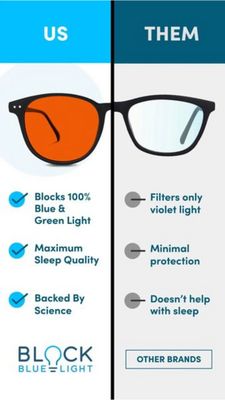
This Story-format comparison template is built to sell blue light blocking glasses by visually contrasting “US” vs “THEM.” The layout is split down the center with a bright cyan header on the left and a darker teal header on the right, creating instant contrast and a clear winner. Large product shots of two frames anchor the top: an orange-tinted lens on the “US” side versus a clear lens on the competitor side. Below, short bullet claims are paired with icons—blue checkmarks for benefits (e.g., blocks blue/green light, maximum sleep quality, backed by science) and muted grey dashes for drawbacks (filters only violet light, minimal protection, doesn’t help with sleep). The clean sans-serif typography and generous white space make it highly scannable on mobile. Strategically, this is ideal for mid-funnel consideration and solution-aware audiences: it uses trust and contrast to reduce doubt and position your product as the evidence-based choice. Customize by swapping benefit bullets to match your lens specs, adding certifications, and replacing the bottom brand lockup with your logo and CTA.