Red Light Therapy Device Review Ad Template - Square
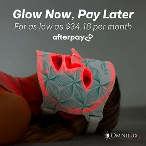
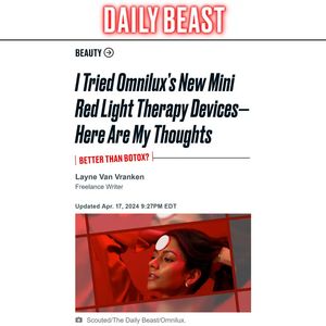
This square ad template is built to promote an at-home red light therapy skincare device using a publisher-style “review” framing. The design mimics a digital magazine article: a bold masthead at the ...
Free for 7 days — Cancel anytime
About This Template
This square ad template is built to promote an at-home red light therapy skincare device using a publisher-style “review” framing. The design mimics a digital magazine article: a bold masthead at the top, a Beauty section label, an oversized italic headline, and a sharp red subhead callout (“Better than Botox?”) that sparks immediate curiosity. A lifestyle image at the bottom shows a model under intense red light, visually communicating the core benefit without needing technical explanations. Strategically, this creative sits in top-of-funnel awareness for an unaware audience: it sells the idea of beauty tech by borrowing credibility cues from editorial layouts and by positioning the message as personal experience (“Here are my thoughts”). The aspiration trigger comes from the polished, minimal newsroom aesthetic, while novelty comes from the futuristic red light visual. Brands can customize by swapping the masthead with a “featured in” banner, replacing the headline with a benefit-led hook, and inserting a clear CTA button while keeping the editorial hierarchy intact for trust and scroll-stopping impact.