Natural Deodorant Product Comparison Ad Template - Square
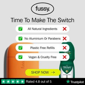
This square ad template is designed for a natural deodorant brand positioned against a conventional antiperspirant. The layout uses a clean, light-grey background with a centered headline (“Time To Ma...
Free for 7 days — Cancel anytime
About This Template
This square ad template is designed for a natural deodorant brand positioned against a conventional antiperspirant. The layout uses a clean, light-grey background with a centered headline (“Time To Make The Switch”) and a brand logo area at the top, creating immediate clarity in-feed. Four rounded comparison bars stack vertically, each pairing a green checkmark with a red X to communicate benefit contrasts at a glance: all-natural ingredients, no aluminium or parabens, plastic-free refills, and vegan/cruelty-free. Product credibility is reinforced with a bright yellow “SHOP NOW” button and a Trustpilot-style rating strip along the bottom (“Rated 4.8 out of 5”) with star icons. Strategically, this creative targets solution-aware shoppers in the consideration stage: it doesn’t explain what deodorant is—it proves why switching is smarter. The eco-friendly and clean-living triggers are baked into the benefit list, while social proof reduces risk. Customize by swapping the compared products, updating the four claims to your differentiators, and matching the accent CTA color to your brand while keeping the high-contrast button for conversion.