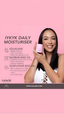
Blemish Repair Serum Before & After Ad Template - Square
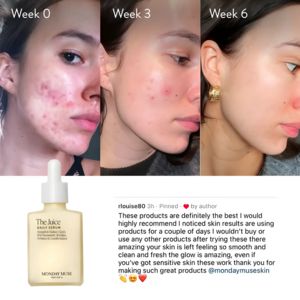
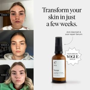
This square skincare ad template is built around a week-by-week transformation for an anti-blemish and scar-repair serum. The left column stacks three authentic-looking face close-ups labeled Week 1, ...
Free for 7 days — Cancel anytime
About This Template
This square skincare ad template is built around a week-by-week transformation for an anti-blemish and scar-repair serum. The left column stacks three authentic-looking face close-ups labeled Week 1, Week 2, and Week 3, making progress easy to scan and instantly believable. On the right, a clean white canvas carries a large, editorial serif headline (“Transform your skin in just a few weeks.”) that signals premium positioning while staying easy to read on mobile. The product bottle is isolated with a curved pointer caption (“Anti-blemish & scar repair Serum”), plus a starburst “Featured in VOGUE Apr 24” badge to add authority. Strategically, the creative uses transformation, social proof, and curiosity—ideal for top-of-funnel audiences who may not yet know your formula but recognize acne marks and texture as pain points. The layout invites viewers to compare, then anchors attention on the bottle as the solution. Brands can customize by swapping the week labels for “Day 7/14/21,” replacing the publication badge with a dermatologist quote, and matching the bottle/typography to their visual identity without losing the high-trust editorial feel.