Sensitive Skin Before & After Serum Ad Template - Square
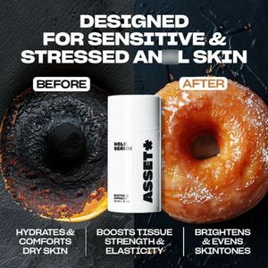
This square skincare ad template promotes a calming face serum positioned as a solution for sensitive, stressed, and dry skin. The design uses a dramatic split “BEFORE/AFTER” concept: a charred, dark ...
Free for 7 days — Cancel anytime
About This Template
This square skincare ad template promotes a calming face serum positioned as a solution for sensitive, stressed, and dry skin. The design uses a dramatic split “BEFORE/AFTER” concept: a charred, dark donut on the left contrasts with a glossy, golden donut on the right, instantly visualizing transformation. A clean white serum bottle packshot is centered over the split, acting as the visual anchor and brand cue. Bold, all-caps sans-serif typography in white delivers high readability against the textured, dark background, while small label-style tags for “BEFORE” and “AFTER” make the claim easy to scan. Strategically, this creative leverages curiosity and self-improvement triggers to move solution-aware users through mid-funnel consideration. The three benefit pillars at the bottom (hydration/comfort, strength & elasticity, brightening/even tone) broaden relevance without cluttering the layout. Brands can customize by swapping the packshot, adjusting the before/after imagery to match their hero claim, and rewriting the benefit trio to align with ingredients (ceramides, centella, niacinamide) and compliance needs.