Skincare Serum Before & After Ad Template - Square
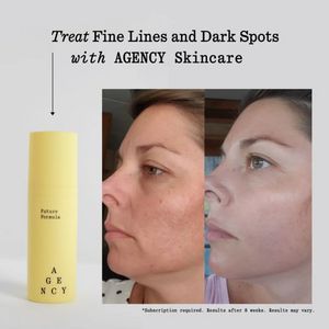
This square skincare ad template is built around a clear before-and-after proof story for a dark-spot and fine-line treatment serum. The composition is simple and credibility-led: a large headline acr...
Free for 7 days — Cancel anytime
About This Template
This square skincare ad template is built around a clear before-and-after proof story for a dark-spot and fine-line treatment serum. The composition is simple and credibility-led: a large headline across the top, a thin arrow guiding the eye down the left column, a tall product bottle render, and a side-by-side facial close-up showing visible tone and texture improvement. A light grey background and classic serif typography create a clinical-yet-premium feel, while the soft yellow packaging adds a warm focal point without overpowering the results imagery. The small disclaimer line at the bottom supports compliance and sets expectations, which is ideal for mid‑funnel consideration audiences who already believe in skincare actives but need reassurance before purchasing. The transformation trigger does the heavy lifting, reducing copy needs and increasing scroll-stopping clarity. Brands can quickly customize by swapping product art, adjusting the claim (e.g., hyperpigmentation, melasma, post-acne marks), replacing the headline with a benefit + timeframe, and matching the accent color to their packaging for a cohesive, trustworthy look.