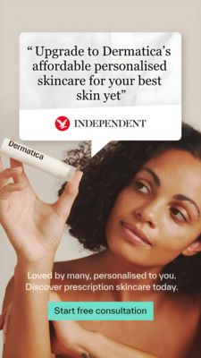
Men’s Skincare Routine Quiz Ad Template - Square
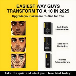
This square ad template is built for a men’s skincare routine or bundle offer that starts with a quick quiz/free routine upgrade. The design uses a high-contrast split background—bold yellow on the le...
Free for 7 days — Cancel anytime
About This Template
This square ad template is built for a men’s skincare routine or bundle offer that starts with a quick quiz/free routine upgrade. The design uses a high-contrast split background—bold yellow on the left and clean off‑white on the right—paired with heavy, uppercase sans-serif headlines for instant feed-stopping impact. On the left, three stacked illustrated male face panels visually cue common concerns (tired eyes, dryness, aging lines), while the right column neatly lists three black product packs with benefit-led labels (dark circle balm, daily moisturizer, wrinkle serum). The bottom black bar functions as a strong CTA zone, separating the message from the product grid and improving readability on mobile. Strategically, it leverages curiosity (“Easiest way…transform”), aspiration, and transformation to hook unaware prospects at top-of-funnel. The quiz framing lowers resistance, making the offer feel personalized and risk-free. Brands can swap the illustrations for real photos, change the three-product lineup, and adapt the color split to match their identity while keeping the structured, checklist-like clarity.