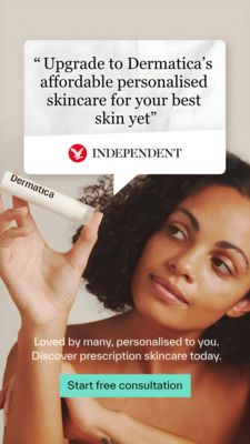
Barrier Repair Cream Clinical Proof Ad Template - Square
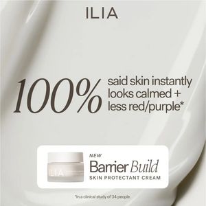
This square skincare ad template is built to promote a barrier-repair face cream with a strong, clinically framed claim. The hero message leads with an oversized “100%” statistic, immediately signalin...
Free for 7 days — Cancel anytime
About This Template
This square skincare ad template is built to promote a barrier-repair face cream with a strong, clinically framed claim. The hero message leads with an oversized “100%” statistic, immediately signaling certainty and results, while the supporting line “skin instantly looks calmed + less red/purple” adds a specific benefit for sensitive, redness-prone skin. The design is minimalist and premium: a soft beige/ivory background with silky cream-like folds, elegant serif numerals paired with clean sans typography, and a rounded white product card anchoring the jar photo and product name. A small clinical footnote at the bottom reinforces trust without cluttering the layout. Strategically, this works best for mid-funnel consideration and solution-aware audiences who already want barrier support and need validation to choose a product. The combination of aspiration (luxury skincare aesthetic) and proof (percentage + study note) reduces perceived risk. Brands can easily customize by swapping the hero statistic, benefit line, jar shot, and the footnote details to match their own clinical data, ingredient claims, or dermatologist testing.