Sunscreen Product Comparison Ad Template - Square
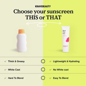
This square skincare ad template is built for promoting a sunscreen by contrasting an “old-school” option with a modern, wearable formula. The layout is a clean split-screen: a generic bottle on the l...
Free for 7 days — Cancel anytime
About This Template
This square skincare ad template is built for promoting a sunscreen by contrasting an “old-school” option with a modern, wearable formula. The layout is a clean split-screen: a generic bottle on the left versus a sleek sunscreen tube on the right, supported by a bold serif headline (“Choose your sunscreen THIS or THAT”) and a hand-drawn arrow that visually invites the choice. A three-row checklist at the bottom makes the comparison instantly scannable, highlighting common objections—greasy feel, white cast, and hard-to-blend texture—while positioning the featured product as lightweight, hydrating, and easy to blend. The color palette mixes soft cream with bright lime, creating a fresh, sun-associated mood without feeling overly clinical. This creative works especially well in mid-funnel consideration for solution-aware shoppers who already want SPF but are undecided. It uses simplicity and curiosity to drive engagement, while the structured claims reduce friction. Customize by swapping the product images, adjusting the benefit rows to your hero differentiators (e.g., “reef-safe,” “SPF 50,” “no pilling”), and replacing the brand line with your logo or product name.