Acne Treatment Before & After Ad Template - Square
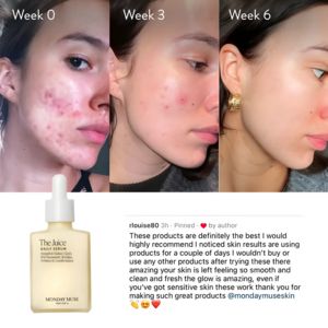
This square skincare ad template is designed for an acne treatment program or prescription-style routine, using a stark before-and-after comparison to make results feel immediate and believable. The l...
Free for 7 days — Cancel anytime
About This Template
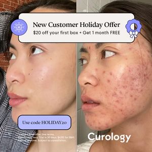
This square skincare ad template is designed for an acne treatment program or prescription-style routine, using a stark before-and-after comparison to make results feel immediate and believable. The layout splits two close-up cheek profile photos side by side, highlighting texture and redness differences for high visual proof. A rounded white headline banner with bold serif type sits at the top, reinforced by holiday-themed blue icons (snowflake and gift) that cue seasonal relevance without overpowering the skincare story. A lavender coupon button (“Use code…”) anchors the lower left, while the brand name placement at the bottom right balances the composition. Strategically, this creative targets problem-aware audiences in mid‑funnel consideration: they already want clearer skin and are evaluating solutions. It leverages transformation and social proof, with the promo framing reducing first‑purchase friction. Brands can customize by swapping the offer amount, seasonal badge, and code color while keeping the split-screen proof and clean typography hierarchy that makes the claim easy to scan in-feed.