SPF 50 Serum Comparison Ad Template - Story
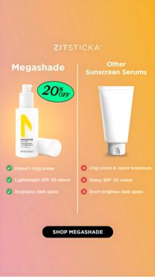
This 9:16 Story template promotes a lightweight SPF 50 sunscreen serum by positioning it against “other sunscreen serums” in a clear side‑by‑side comparison. The design uses a warm peach-to-golden gra...
Free for 7 days — Cancel anytime
About This Template
This 9:16 Story template promotes a lightweight SPF 50 sunscreen serum by positioning it against “other sunscreen serums” in a clear side‑by‑side comparison. The design uses a warm peach-to-golden gradient background that evokes sunshine and summer protection, while clean white typography keeps the message readable on mobile. A vertical divider splits the canvas: the left side features a premium pump-bottle product shot with a green “20% OFF” badge, and the right side shows a plain white tube as the competing alternative. Benefit claims are organized as checkmarks versus red X’s (e.g., doesn’t clog pores, lightweight SPF 50, brightens dark spots), making scanning effortless for solution-aware shoppers in the consideration stage. The contrast between “yes” and “no” points creates curiosity and reduces decision friction by highlighting functional differentiators. Brands can customize by swapping the bottle/tube renders, adjusting the bullet claims to match clinical results, and recoloring the discount badge to align with brand accents while preserving the high-contrast comparison structure.