Soothing Serum Before & After Ad Template - Square
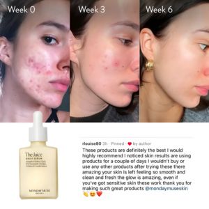
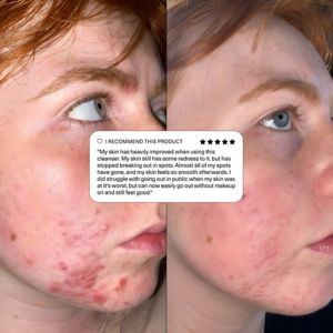
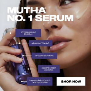
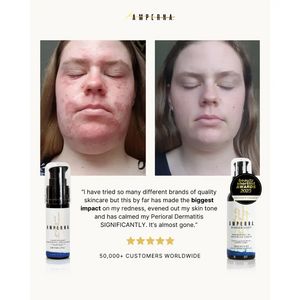
This square skincare ad template is built to sell a soothing, redness-calming serum using a high-credibility before-and-after proof format. The layout places two large facial photos side-by-side at th...
Free for 7 days — Cancel anytime
About This Template
This square skincare ad template is built to sell a soothing, redness-calming serum using a high-credibility before-and-after proof format. The layout places two large facial photos side-by-side at the top, making the improvement in skin redness the hero message at first glance. Below, a centered testimonial quote in clean serif/sans typography provides detailed context (“biggest impact on my redness… calmed… significantly”), reinforcing consideration-stage decision making. Product bottles anchor the left and right corners to keep packaging recognition high, while a Beauty Shortlist Awards 2023 badge and a five-star row add authority and social proof. The palette is minimalist and clinical—warm off-white background, black text, gold accents, and deep navy on the bottle labels—supporting a “dermatitis-friendly / sensitive-skin” positioning. This approach works for solution-aware shoppers who want evidence before switching brands. Customize by swapping in your own before/after images, inserting a verified review, and replacing the award badge with dermatologist claims, certifications, or press logos while keeping the symmetrical structure intact.