Eye Recovery LED Mask Transformation Ad Template - Square
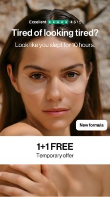
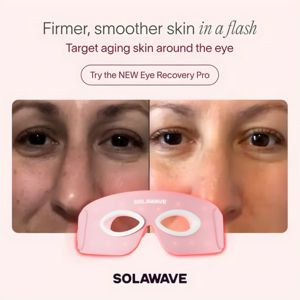
This square skincare ad template is built for an at-home eye-area beauty device, showcasing a clear before/after transformation. The design uses a soft blush background with high-contrast typography: ...
Free for 7 days — Cancel anytime
About This Template
This square skincare ad template is built for an at-home eye-area beauty device, showcasing a clear before/after transformation. The design uses a soft blush background with high-contrast typography: a large promise-led headline (“Firmer, smoother skin”) and a secondary line that pinpoints the pain point—visible aging around the eyes. A rounded, pill-shaped CTA button sits above the imagery, guiding solution-aware users into consideration without needing heavy explanation. The central visual is a split-screen close-up of the same face, emphasizing under‑eye texture and brightness changes. A pink LED eye mask product shot overlaps the bottom edge of the comparison, connecting the result directly to the device and reinforcing credibility through visual causality. This structure leverages curiosity and aspiration ("in a flash") while keeping the message clean and premium. Brands can easily customize by swapping the model photos, adjusting the claim to match clinical results, and recoloring the CTA border to a brand accent while keeping the soft, dermatology-adjacent palette that feels safe and beauty-forward for eye-care shoppers.