Language Learning App Fun Quiz Ad Template - Square
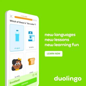
This square ad template promotes a language learning app using a playful, game-like quiz interface as the hero visual. On the left, a tilted smartphone mockup shows a multiple-choice vocabulary questi...
Free for 7 days — Cancel anytime
About This Template
This square ad template promotes a language learning app using a playful, game-like quiz interface as the hero visual. On the left, a tilted smartphone mockup shows a multiple-choice vocabulary question (“Which of these is ‘the water’?”) with illustrated answer cards, a progress bar, and an “Excellent!” feedback strip—instant cues of interactivity and achievement. The right side keeps copy minimal and punchy (“new languages / new lessons / new learning fun”) with a prominent rounded “LEARN NOW” button, creating a clear scan path from proof-of-experience to action. The bright lime-green background and soft, rounded typography signal friendliness and low effort, leveraging curiosity and fun while tapping self-improvement—ideal for top-of-funnel awareness among users not yet actively shopping for a course. The template works because it demonstrates the product in-context (micro-moment learning) rather than promising abstract results. Customize by swapping the quiz language, icons, and streak/progress metric, updating the tagline to your value prop (e.g., 5-minute lessons, travel phrases), and recoloring the background to match brand guidelines while preserving the high-contrast CTA area.