Logic Learning Habit Swap Ad Template - Square
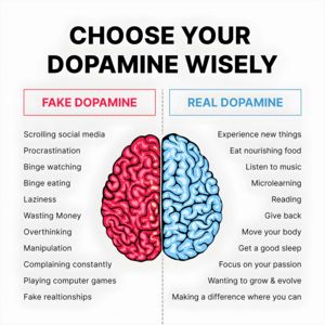
This square education ad template promotes a microlearning or brain-training app by reframing a familiar pain: doom-scrolling. The design is intentionally minimal and meme-like for fast comprehension—...
Free for 7 days — Cancel anytime
About This Template
This square education ad template promotes a microlearning or brain-training app by reframing a familiar pain: doom-scrolling. The design is intentionally minimal and meme-like for fast comprehension—white background, bold black headline, and a split-screen portrait divided by a thin vertical line. The left/right labels (“Lying” vs “Not Lying”) create an instant contrast that feels like a social post, increasing shareability and curiosity. A simple brand name at the top acts as a lightweight logo lockup while keeping the message dominant. Strategically, it’s top-of-funnel awareness for an unaware audience: it doesn’t assume the viewer is already searching for logic training, it simply positions the product as a smarter default behavior. The psychological triggers are self-improvement and novelty, with a touch of humor that lowers resistance. This approach works well for students, young professionals, and productivity-minded users who want quick wins. Customize by swapping the brand name, replacing the face with your audience archetype, changing the left/right labels to your key contrast, and adding a small CTA line (e.g., “Try 5 minutes/day”) without breaking the clean layout.