Dopamine Habits Comparison Ad Template - Square
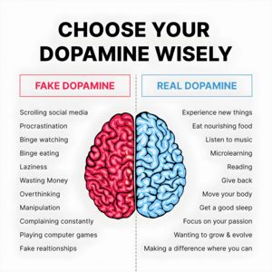
This square infographic-style ad template promotes a mental wellbeing or self-improvement resource (e.g., a dopamine detox mini-course, coaching program, or newsletter). The design is clean and highly...
Free for 7 days — Cancel anytime
About This Template
This square infographic-style ad template promotes a mental wellbeing or self-improvement resource (e.g., a dopamine detox mini-course, coaching program, or newsletter). The design is clean and highly scannable: a bold, all-caps headline sits at the top, followed by two boxed labels—“Fake Dopamine” in red on the left and “Real Dopamine” in blue on the right—separated by a dotted vertical divider. A central brain illustration split into red/blue reinforces the contrast message, while two aligned bullet lists provide quick examples of “unhelpful” versus “healthy” behaviors. The stark white background and heavy black typography keep attention on the content and increase readability on mobile feeds. Strategically, the creative uses curiosity and self-optimization triggers at top-of-funnel awareness: it names a relatable problem (low-quality dopamine hits) and offers an immediate framework to re-evaluate habits without requiring prior knowledge. It’s easy to customize by swapping list items, adjusting the red/blue accent colors to match a brand, and adding a CTA line or logo to drive “learn more” clicks to a guide or course landing page.