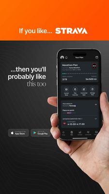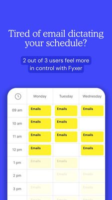
Scheduling App Relief Ad Template - Story
This 9:16 Story template promotes a calendar scheduling app that helps professionals stop letting email control their day. The design uses a bold cobalt-blue full-bleed background with a large, elegan...
Free for 7 days — Cancel anytime
About This Template
This 9:16 Story template promotes a calendar scheduling app that helps professionals stop letting email control their day. The design uses a bold cobalt-blue full-bleed background with a large, elegant white headline centered high on the canvas. A darker rounded pill beneath the headline highlights a simple data point (“2 out of 3 users…”) to add instant credibility. The bottom half is dominated by a clean, iOS-style weekly calendar UI inside a white rounded frame, filled with bright yellow “Emails” blocks—an immediate visual metaphor for inbox overload. Strategically, it’s top-of-funnel awareness aimed at users who feel the pain but may not yet be shopping for a tool. The opening question triggers curiosity and recognition; the stat offers relief and efficiency as the promised outcome. This approach works because it communicates the problem in one glance, then hints at a solution without heavy explanation. Customize by swapping the app name, replacing the stat with your real metric, and updating the calendar blocks to match your audience (meetings, focus time, client calls) while keeping the strong blue/yellow contrast for scannability on mobile.