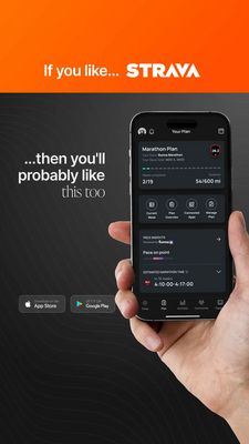
Customer Support Chatbot Workflow Ad Template - Square
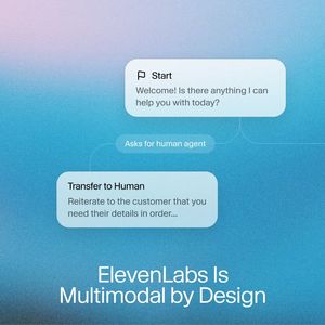
This square SaaS ad template is built to promote a customer-support chatbot or workflow automation platform. The design mimics a chat UI: rounded message cards float on a cool blue gradient background...
Free for 7 days — Cancel anytime
About This Template
This square SaaS ad template is built to promote a customer-support chatbot or workflow automation platform. The design mimics a chat UI: rounded message cards float on a cool blue gradient background, connected by subtle curved lines that suggest a guided flow. A large, clean sans-serif headline sits at the bottom, leaving ample negative space for brand messaging while keeping the interface elements as the hero visual. Strategically, it leans into efficiency and innovation—ideal for middle-of-funnel audiences who already know they need better support operations and are comparing solutions. The chat bubbles (“Start,” “Asks for human agent,” “Transfer to Human”) communicate capability at a glance: automated triage with seamless human handoff. That clarity reduces perceived implementation risk and makes the product feel enterprise-ready. Customization is straightforward: swap the flow steps for your own key intents (refunds, onboarding, lead capture), replace the headline with a benefit-driven promise, and add a logo/CTA in the open lower area. The cool palette and UI metaphor work especially well for tech brands targeting support leaders and CX teams.