Online Form Builder Multi-Use Ad Template - Square
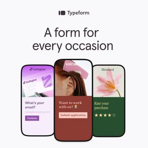
This square SaaS ad template promotes an online form builder by showing three mobile-style screens that represent different real-world use cases: email capture, job applications, and post-purchase rat...
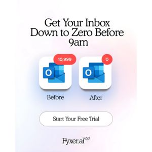
Free for 7 days — Cancel anytime
About This Template
This square SaaS ad template promotes an online form builder by showing three mobile-style screens that represent different real-world use cases: email capture, job applications, and post-purchase ratings. The design is clean and product-led, with a light neutral background, a large centered headline, and rounded “phone” frames that make the interface the hero. Each screen uses distinct brand-like color blocks (lavender, brick red, deep green) to signal variety while keeping the layout consistent and easy to scan. Strategically, the creative leans on simplicity and productivity triggers: viewers instantly understand what the product does and where it fits in their workflow. It’s ideal for top-of-funnel awareness with an “unaware” audience because it explains the category through visual examples instead of dense feature lists. Customization is straightforward—swap the three screenshots for your own form flows, replace the headline with a specific promise (e.g., “Collect leads in minutes”), and align the accent colors and buttons to your brand for cohesive cross-channel campaigns.