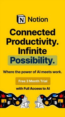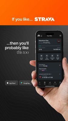
Work Messaging App Relatable Humor Ad Template - Square
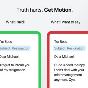
This square ad template promotes a workplace communication app that helps professionals say the right thing at work. The design uses a clean, light-gray background with a bold headline at the top (“Tr...
Free for 7 days — Cancel anytime
About This Template
This square ad template promotes a workplace communication app that helps professionals say the right thing at work. The design uses a clean, light-gray background with a bold headline at the top (“Truth hurts. Get Motion.”), followed by a split comparison: on the left, a green-framed message window labeled “What I said,” and on the right, a red-framed version labeled “What I want to say.” Inside each panel, an email-style resignation draft contrasts polite corporate language with an unfiltered, funny version—instantly communicating the product benefit: translating stressful workplace feelings into safe, professional messages. The visual strategy leans on humor, relatability, and curiosity at top-of-funnel awareness. The green/red framing creates immediate comprehension (acceptable vs. risky), while the large, high-contrast typography keeps it scroll-stopping in a feed. It’s ideal for audiences who feel work stress and micromanagement pressure, offering a “permission to laugh” moment that smoothly introduces the app. Brands can customize by swapping scenarios (performance reviews, client emails), updating the app name, and adjusting accent colors to match their UI.