Document Workflow Cost Savings Ad Template - Story
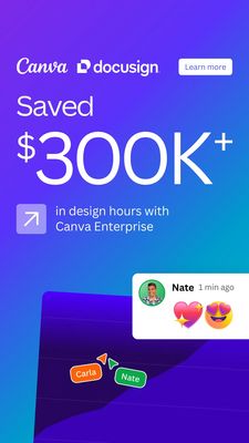
This 9:16 Story template promotes a document workflow or e‑signature integration for teams, with a bold ROI claim front and center. The design uses a smooth purple-to-blue gradient background, minimal...
Free for 7 days — Cancel anytime
About This Template
This 9:16 Story template promotes a document workflow or e‑signature integration for teams, with a bold ROI claim front and center. The design uses a smooth purple-to-blue gradient background, minimal white typography, and an oversized “$300K+” savings figure that instantly anchors attention while scanning on mobile. Top branding space is reserved for partner logos, and a clean rounded “Learn more” button supports a low-friction awareness CTA. Subtle UI cues—an upward-arrow icon, a collaboration-style comment bubble, and name tags—signal productivity, teamwork, and real product usage without cluttering the frame. Strategically, it leverages curiosity (“Saved $300K+”) and efficiency triggers to move unaware audiences into problem recognition: time and cost leakage in design and document processes. The social-proof hint in the chat/reaction element adds credibility without needing a full testimonial paragraph. Customize by swapping the savings metric (hours, dollars, turnaround time), replacing logos with your integrations, and dropping in a screenshot snippet that matches your product UI while keeping the strong contrast and large-number hierarchy intact.