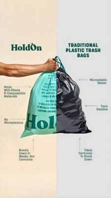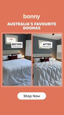
Houseplant Delivery Comparison Ad Template - Story
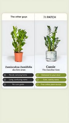
Designed for a houseplant delivery brand, this Story-format template uses a clear side-by-side comparison to make the value proposition instantly understandable for cold audiences. The layout is split...
Free for 7 days — Cancel anytime
About This Template
Designed for a houseplant delivery brand, this Story-format template uses a clear side-by-side comparison to make the value proposition instantly understandable for cold audiences. The layout is split into two vertical panels: on the left, “The other guys” shows a generic potted plant with a long botanical name and three dark, pill-shaped drawback bullets; on the right, the branded option (“PATCH”) features a more premium plant in a marble-look pot with three green, check-mark benefit bullets. The minimalist light background, generous white space, and bold serif plant names create an editorial, home-decor feel while keeping the message scannable on mobile. Psychologically, it leverages comparison and convenience triggers: it contrasts friction (carrying home, confusing naming, no care guide) with effortless service (door delivery, friendly naming, online plant doctor). This makes it ideal for top-of-funnel awareness where viewers are unaware they need a better way to buy plants. Swap the plant photo, rename the “friendly” plant label, and tailor the three bullet benefits to your offer (care cards, guarantees, or styling advice) to fit different indoor gardening and home décor brands.