Neck Pain Relief Pillow Press Feature Ad Template - Square
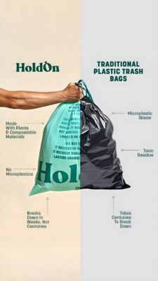
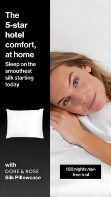
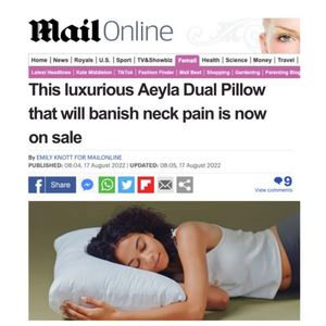
This square ad template mimics a digital news article screenshot to promote a neck-pain relief pillow (shown as a plush white pillow) with strong “press-feature” credibility. The layout is top-heavy a...
Free for 7 days — Cancel anytime
About This Template
This square ad template mimics a digital news article screenshot to promote a neck-pain relief pillow (shown as a plush white pillow) with strong “press-feature” credibility. The layout is top-heavy and text-forward: a recognizable newspaper-style masthead area, category navigation bars, a bold black headline, author/date line, and social-share icons, followed by a large lifestyle photo of a woman sleeping on her side hugging the pillow. The clean white background and black typography create an authoritative, editorial feel, while small accent colors (notably a magenta navigation tab and multicolor share icons) add realism and scanability. Strategically, this creative plays to comfort/relief triggers and aspirational rest, ideal for TOF awareness and “unaware” audiences who respond to third‑party validation more than product specs. It frames the pillow as a discovered solution rather than a hard sell, lowering skepticism around health-related claims. Brands can customize the headline promise, swap the publisher styling, replace the lifestyle image with their own bedding aesthetic, and adjust the callout to match compliance-friendly wording (e.g., “helps relieve” vs. “banish”).