Wellness Therapy Device No-Meds Ad Template - Square
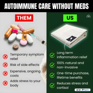
This square comparison ad template is built to promote an at‑home, non‑invasive wellness therapy device positioned as an alternative to medications for autoimmune or inflammation concerns. The layout ...
Free for 7 days — Cancel anytime
About This Template
This square comparison ad template is built to promote an at‑home, non‑invasive wellness therapy device positioned as an alternative to medications for autoimmune or inflammation concerns. The layout is a crisp split-screen: the left “THEM” panel sits on a light gray background with a pile of pills and a syringe, paired with red X icons and drawback bullets (temporary relief, side effects, ongoing costs, added stress). The right “US” panel uses a dark green gradient with a clear product hero (a folded fabric pad/device) and bright green checkmarks highlighting benefits like long‑term inflammation relief, natural/non‑invasive approach, one‑time purchase, and stress/cortisol reduction. Typography is bold, condensed, and high-contrast, engineered for instant scanning in a feed. Strategically, this is MOF consideration creative: it assumes the audience already knows their problem and is evaluating solutions. The “them vs us” framing leverages contrast bias and risk reduction, while the cost and safety points address hesitation. Brands can quickly customize by swapping the product shot, adjusting the benefit bullets to compliant claims, and recoloring the green/red accents to match brand guidelines while preserving the strong comparative structure.