Knee Joint Pain Relief Before vs After Ad Template - Square
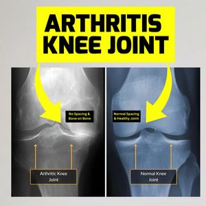
This square health-and-wellness ad template is built for knee joint pain relief products and services—such as arthritis supplements, physiotherapy programs, orthopedic clinics, or mobility braces. The...
Free for 7 days — Cancel anytime
About This Template
This square health-and-wellness ad template is built for knee joint pain relief products and services—such as arthritis supplements, physiotherapy programs, orthopedic clinics, or mobility braces. The design uses a high-contrast, attention-grabbing yellow headline block with bold black typography reading “ARTHRITIS KNEE JOINT,” instantly calling out the problem for unaware scrollers. Below, a split-screen X-ray comparison shows an “Arthritic Knee Joint” versus a “Normal Knee Joint,” supported by large curved yellow arrows that guide the eye across the before/after narrative. Small black callout labels (“No spacing & bone on bone” vs “Normal spacing & healthy joint”) add credibility and make the claim easy to understand without medical jargon. Strategically, this creative leans on fear + problem recognition + curiosity at top-of-funnel: it visualizes what’s happening inside the body and prompts viewers to seek an explanation or solution. It’s ideal for brands that want clicks to an educational landing page, a symptom checker, or a consultation booking. Customize by swapping the headline, adding your brand color accents, and replacing labels with your specific mechanism, offer, or clinic location.