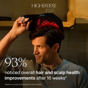
Health Program Before vs After Ad Template - Story
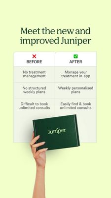
This 9:16 Story template is built for a health program or subscription-style treatment service that’s managed through an app. The creative leads with a clean headline (“Meet the new and improved…”) to...
Free for 7 days — Cancel anytime
About This Template
This 9:16 Story template is built for a health program or subscription-style treatment service that’s managed through an app. The creative leads with a clean headline (“Meet the new and improved…”) to signal a product update, then uses a structured before/after comparison table to make the improvement instantly scannable. On the left, a red X flags the old experience (no treatment management, no structured weekly plans, hard-to-book consults). On the right, a green check highlights the upgraded solution (in‑app management, weekly personalised plans, easy unlimited consult booking). A pale mint background and dark green serif typography create a calm, clinical-trust feel, while the handheld branded box at the bottom anchors the offer as a tangible subscription kit. Psychologically, this design combines convenience and trust at a mid‑funnel consideration stage: it reduces perceived risk by clarifying features and removes friction by emphasizing management and booking. Brands can swap the table rows for their own key differentiators, replace the box with a product/kit photo, and adjust accents to match brand colors without losing the crisp comparison structure.