Toothpaste Bits Product Comparison Ad Template - Story
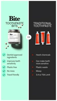
This Story-format ad template is built for oral care brands selling toothpaste tablets/bits and positions them against traditional toothpaste in a clean, high-contrast comparison. The layout is split ...
Free for 7 days — Cancel anytime
About This Template
This Story-format ad template is built for oral care brands selling toothpaste tablets/bits and positions them against traditional toothpaste in a clean, high-contrast comparison. The layout is split vertically: a mint-green left panel highlights the “better” option with a jar product shot and scattered bits, while a charcoal right panel shows toothpaste tubes as the alternative. A centered “VS” badge makes the comparison instantly scannable. Benefit claims are organized as a checklist with green check icons on the left and red X icons on the right—perfect for fast thumb-stopping comprehension on mobile. Strategically, it targets solution-aware shoppers in the consideration stage by reducing perceived risk (dentist-approved, no mess) and amplifying triggers like convenience, cleanliness, eco-friendliness, and travel readiness (plastic-free, TSA-friendly). The modern serif/sans typography mix feels premium yet approachable. Customize by swapping product photos, updating the benefit bullets to match your formulation, and adjusting the accent colors to your brand while preserving the green-vs-dark contrast that makes the argument persuasive at a glance.