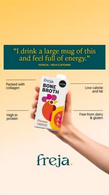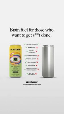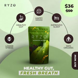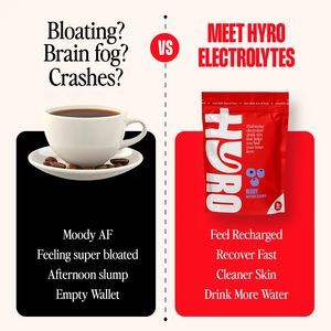
Electrolyte Drink Mix vs Coffee Ad Template - Square
This square comparison ad template is built for an electrolyte drink mix (or hydration supplement) positioned as a smarter alternative to coffee. The layout is a clean split-screen with a dotted verti...
Free for 7 days — Cancel anytime
About This Template
This square comparison ad template is built for an electrolyte drink mix (or hydration supplement) positioned as a smarter alternative to coffee. The layout is a clean split-screen with a dotted vertical divider and a bold “VS” badge, making the message instantly scannable in-feed. On the left, a coffee cup sits above a matte black panel listing pain-point outcomes (“Moody,” bloating, afternoon slump, empty wallet). On the right, a vibrant red product pouch is heroed above a matching red panel listing benefit claims (recharged, recover fast, cleaner skin, drink more water). The color strategy is high-contrast and decisive: neutral cream background for clarity, black for “problem,” and red for “solution,” with oversized condensed headline type to stop the scroll. Psychologically, it leverages curiosity and comparison to reframe habitual caffeine use, ideal for mid-funnel, solution-aware audiences already seeking better energy and hydration. Brands can swap the pouch, flavors, and benefit bullets while keeping the VS structure to maintain clarity and persuasion.