Grass-Fed Ribeye Comparison Ad Template - Square
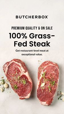
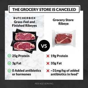
This square food & beverage ad template is designed to sell premium, delivery-ready ribeye steaks by using a direct side‑by‑side comparison against “grocery store” meat. The layout is a clean split-sc...
Free for 7 days — Cancel anytime
About This Template
This square food & beverage ad template is designed to sell premium, delivery-ready ribeye steaks by using a direct side‑by‑side comparison against “grocery store” meat. The layout is a clean split-screen: the left panel features vacuum-sealed ribeyes on a light marble background with bold product naming, while the right panel shows a single packaged ribeye on a white field. A centered black “VS” badge anchors the comparison, and the bottom section turns specs into a quick decision tool using green checkmarks vs red Xs (protein, fat, and antibiotics/hormones callouts). The headline bar at the top (“THE GROCERY STORE IS CANCELED”) uses strong, high-contrast typography to stop scroll and position the brand as the smarter upgrade. Psychologically, the creative leverages comparison and quality/health-conscious triggers—ideal for mid‑funnel, solution-aware shoppers who already buy steak but are weighing where to source it. It’s easy to customize by swapping cuts, nutrition metrics, sourcing claims, and brand name while keeping the same high-clarity structure.