Mushroom Coffee Problems-Solution Ad Template - Square
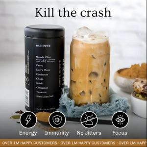
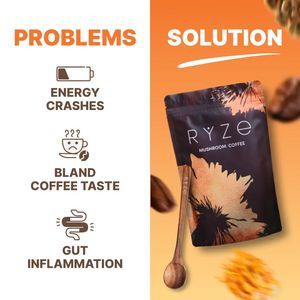
This square ad template is built for a functional beverage—specifically a mushroom coffee blend—using a clear “problems vs solution” structure that works perfectly in mid‑funnel consideration. The lay...
Free for 7 days — Cancel anytime
About This Template
This square ad template is built for a functional beverage—specifically a mushroom coffee blend—using a clear “problems vs solution” structure that works perfectly in mid‑funnel consideration. The layout is split vertically: a clean white left panel lists three pain points with simple line icons (battery for energy crashes, a sad cup for bland taste, and a gut icon for inflammation), while the right panel shifts to a warm orange gradient and showcases the packaged product at an angle with coffee beans and a wooden spoon for sensory appeal. Bold, all‑caps typography keeps scanning effortless and emphasizes contrast between the negative list and the solution headline. Psychologically, it combines curiosity and novelty (mushroom coffee as an alternative to regular coffee) with aspiration (a smoother, better-feeling daily ritual). The direct pain-point bullets help solution-aware buyers quickly self-qualify, while the strong product hero shot reduces ambiguity and supports trust. Brands can easily swap the three problem claims, adjust icon style, and recolor the right gradient to match packaging—without losing the high-clarity structure that drives clicks.