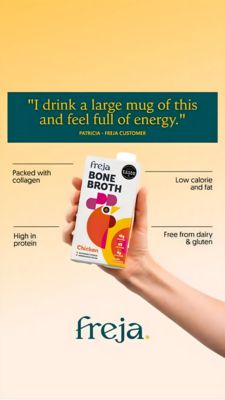
Protein Bar Nutrition Comparison Ad Template - Story
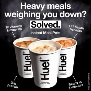
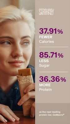
This 9:16 Story template promotes a protein bar using a clear, data-led comparison angle. The layout is split vertically: a warm lifestyle close-up of a person holding a wrapped bar on the left, and a...
Free for 7 days — Cancel anytime
About This Template
This 9:16 Story template promotes a protein bar using a clear, data-led comparison angle. The layout is split vertically: a warm lifestyle close-up of a person holding a wrapped bar on the left, and a clean stats column on the right with three stacked callouts. Large purple percentages highlight the key claims—fewer calories, less sugar, and more protein—each separated by thin divider lines for fast scanning. A small top wordmark and a bottom footnote (“vs the next leading protein bar”) reinforce brand presence and credibility without clutter. The creative leverages curiosity and comparison triggers, ideal for mid-funnel, solution-aware audiences who already consider “better-for-you” snacks but need proof to choose. The calm beige palette feels trustworthy and premium, while the bold numerals deliver authority and instant comprehension on mobile. Brands can customize by swapping the flavor shot, updating competitor benchmarks, and aligning the accent color with their packaging, while keeping the three-metric structure that makes the argument persuasive in a single glance.