Relaxation Drink Comparison Ad Template - Square
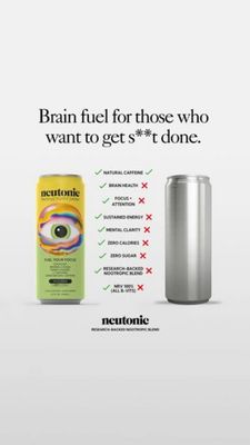
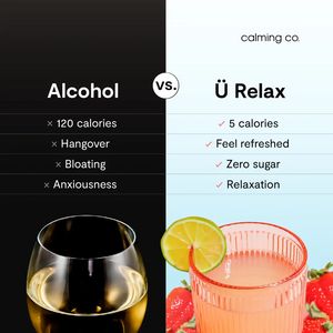
This square split-screen template promotes a calming, low-calorie functional beverage positioned as a smarter alternative to alcohol. The layout is a direct “Alcohol vs. Ü Relax” comparison: a dark, m...
Free for 7 days — Cancel anytime
About This Template
This square split-screen template promotes a calming, low-calorie functional beverage positioned as a smarter alternative to alcohol. The layout is a direct “Alcohol vs. Ü Relax” comparison: a dark, moody left panel with a wine glass and negative bullet points (120 calories, hangover, bloating, anxiousness) contrasts a bright, airy right panel branded “calming co.” with pink checkmarks highlighting benefits (5 calories, feel refreshed, zero sugar, relaxation). The high-contrast black vs. pale blue background creates instant scanning and clear side-taking, while the centered “vs.” badge reinforces the head-to-head framing. Strategically, it uses comparison and health-conscious triggers in a mid-funnel consideration context: viewers already know the category, and the template gives quick reasons to switch. The clean sans-serif typography and checklist structure feel factual and shareable, ideal for audiences weighing wellness trade-offs. Brands can customize by swapping the product name, updating nutrition/claims, changing the hero drink photo (flavor cues like lime/strawberry), and adjusting the benefit list to match regulatory-approved messaging and differentiators.