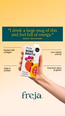
Electrolyte Drink Mix Comparison Ad Template - Square
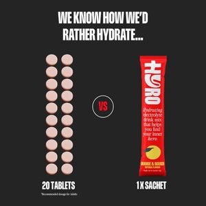
This square ad template is built for hydration brands selling electrolyte drink mix in single-serve sachets. The design uses a dark charcoal background with a bold, condensed white headline at the top...
Free for 7 days — Cancel anytime
About This Template
This square ad template is built for hydration brands selling electrolyte drink mix in single-serve sachets. The design uses a dark charcoal background with a bold, condensed white headline at the top (“We know how we’d rather hydrate…”), immediately setting up a playful preference test. The center “VS” badge creates a clear comparison framework: on the left, a neat grid of pale tablets labeled “20 tablets”; on the right, a tall, vibrant red sachet pack shot labeled “1x sachet.” This simple side-by-side contrast leverages curiosity and simplicity—perfect for top-of-funnel audiences who aren’t actively shopping yet, but will pause to resolve the question. The visual hierarchy is strong: high-contrast typography for readability, generous negative space for focus, and one punchy accent color (red) that makes the featured product feel like the winner without needing heavy claims. Brands can customize by swapping the pack shot, changing the “tablets” competitor visual (pills, powders, bottles), and updating the bottom captions to match their key differentiator (convenience, taste, travel, sugar-free).