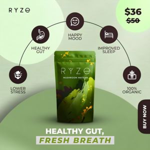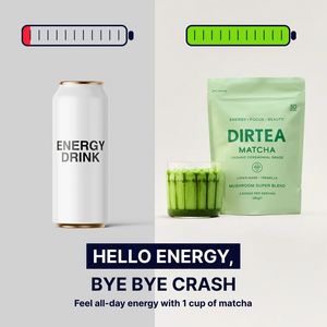
Matcha Powder No Crash Energy Ad Template - Square
This square ad template promotes matcha powder as a cleaner alternative to traditional energy drinks. The design uses a split-screen comparison: on the left, a minimalist white can labeled “ENERGY DRI...
Free for 7 days — Cancel anytime
About This Template
This square ad template promotes matcha powder as a cleaner alternative to traditional energy drinks. The design uses a split-screen comparison: on the left, a minimalist white can labeled “ENERGY DRINK” sits under a nearly empty battery icon with a red low-charge segment; on the right, a soft green matcha pouch with a glass of vivid green matcha sits under a fully charged green battery. A bold navy headline block anchors the bottom (“HELLO ENERGY, BYE BYE CRASH”) with a supporting line promising all‑day energy from one cup. The visual story is instantly understood even on mobile: “switch from crash to steady energy.” This makes it ideal for top‑of‑funnel awareness and solution‑aware audiences who already want an energy boost but are weighing “clean” options. The high contrast between neutral backgrounds, deep navy typography, and fresh green product cues signals healthiness and focus while keeping the layout uncluttered. Brands can swap the packshot, battery colors, and subhead to highlight benefits like jitters-free energy, focus, or beauty-from-within ingredients.