Jogger Pants Price Comparison Ad Template - Square
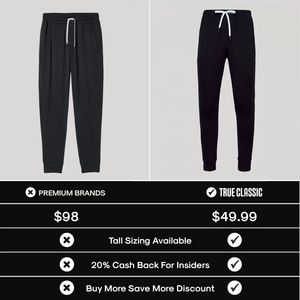
This square fashion ad template is built for bottom-of-funnel shoppers comparing options before buying. The layout is a clean split-screen: two black jogger pants on a light gray background, separated...
Free for 7 days — Cancel anytime
About This Template
This square fashion ad template is built for bottom-of-funnel shoppers comparing options before buying. The layout is a clean split-screen: two black jogger pants on a light gray background, separated by a vertical divider, instantly signaling a head-to-head matchup. A bold black comparison table anchors the bottom half, using large pricing ($98 vs $49.99) and simple X/check icons to highlight value differences at a glance. The typography is strong, all-caps, and high-contrast, optimized for fast mobile scanning. The marketing strategy combines price contrast and value savings with lightweight social proof cues (brand column labeling) to reduce purchase anxiety and justify switching from “premium brands” to the featured brand. Feature rows like tall sizing, insider cash back, and volume discounts stack practical reasons to choose the right-side option. Customize by swapping product photos, adjusting the price line to your offer, and rewriting the benefit rows to match your strongest differentiators (fit guarantee, free returns, fabric tech). Keep the iconography consistent to preserve the quick-compare effect that drives decision clicks.