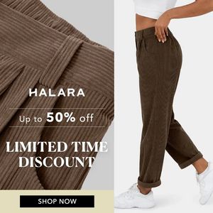
Men’s Stretch Shorts Comparison Ad Template - Square
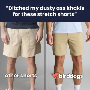
This square fashion ad template promotes men’s stretch shorts using a clean side-by-side comparison that makes the upgrade instantly obvious. A dark navy header carries a large, bold quote (“Ditched m...
Free for 7 days — Cancel anytime
About This Template
This square fashion ad template promotes men’s stretch shorts using a clean side-by-side comparison that makes the upgrade instantly obvious. A dark navy header carries a large, bold quote (“Ditched my dusty ass khakis…”) to grab attention with conversational, slightly provocative copy that feels like a real customer line. Below, the layout splits into two product-on-body photos: “other shorts” on the left versus the featured brand on the right, separated by a vertical divider for fast scanning. The bottom labels and logo lockup reinforce the choice without needing dense specs. Strategically, this creative sits in mid‑funnel consideration for solution‑aware shoppers: they already wear khaki-style shorts, but need a reason to switch. The comparison framing triggers curiosity and “comfort upgrade” expectations while the testimonial-style headline supplies lightweight social proof. It’s easy to customize by swapping the quote, updating the brand mark, and replacing the two images with your fit/feature contrast (stretch vs. stiff, tailored vs. boxy, sweat‑wicking vs. cotton) while keeping the same decisive split-screen structure.