Minimalist Wallet Slim vs Bulky Ad Template - Square
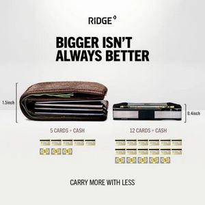
This square ad template promotes a minimalist slim wallet by contrasting it directly with a traditional bulky bifold. The design is intentionally clean and comparison-led: a light gray/white backgroun...
Free for 7 days — Cancel anytime
About This Template
This square ad template promotes a minimalist slim wallet by contrasting it directly with a traditional bulky bifold. The design is intentionally clean and comparison-led: a light gray/white background, bold condensed black headline (“Bigger isn’t always better”), and two product photos placed side-by-side with thickness callouts (inches) to make the benefit instantly measurable. Under each wallet, capacity is simplified into clear labels (“5 cards + cash” vs “12 cards + cash”) supported by small card and cash icons—turning specs into an easy visual proof. Strategically, this creative works in mid‑funnel consideration for solution‑aware shoppers who already want to reduce pocket bulk but need a compelling reason to switch. The triggers are convenience and aspiration: carry more, look sleeker, feel organized. The minimal typography and ample whitespace signal premium utility and reduce cognitive load. Customize by swapping the left ‘old wallet’ photo with your most common competitor style, updating the capacity icons to your exact numbers, and replacing the brand wordmark with your logo while keeping the strong headline hierarchy intact.