Boxer Shorts Pockets Comfort Ad Template - Square
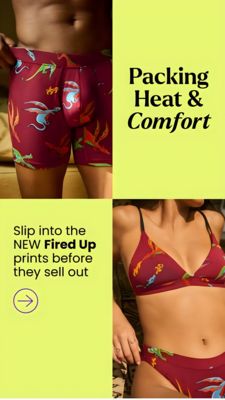
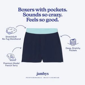
This square fashion ad template is built to sell men’s boxer shorts/loungewear by making one standout feature instantly obvious: pockets. A large, centered product shot (navy shorts with a light aqua ...
Free for 7 days — Cancel anytime
About This Template
This square fashion ad template is built to sell men’s boxer shorts/loungewear by making one standout feature instantly obvious: pockets. A large, centered product shot (navy shorts with a light aqua waistband) sits on a clean off‑white background, while playful line-drawn icons and curved arrows call out three benefits: a no‑tug waistband, premium modal French terry, and deep stretchy pockets. The oversized serif headline at the top uses a curiosity hook (“Sounds so crazy”) followed by a comfort payoff (“Feels so good”), perfectly suited for solution-aware shoppers comparing options. The design balances minimalism and clarity: plenty of whitespace, high-contrast navy typography, and short feature labels that read fast on mobile feeds. This approach works mid‑funnel because it reduces friction—viewers can understand material, fit, and functional value in seconds—then associate it with a premium brand feel via restrained typography and tidy layout. Customize by swapping the product color, replacing the three callouts with your differentiators (anti-roll waist, breathable knit, tagless), and adding a price or offer badge for stronger conversion.