Earplugs Curiosity Quiz Ad Template - Story
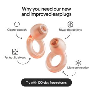
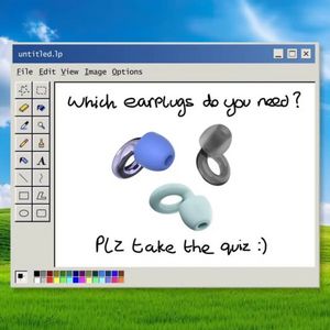
This 9:16 Story template promotes protective audio accessories like reusable concert earplugs. It uses a soft blush-to-rose gradient background with airy white typography and a clean, centered composi...
Free for 7 days — Cancel anytime
About This Template
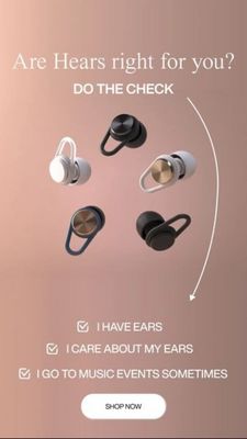
This 9:16 Story template promotes protective audio accessories like reusable concert earplugs. It uses a soft blush-to-rose gradient background with airy white typography and a clean, centered composition. Five floating earplug renders in different colorways sit mid-frame, immediately signaling product variants without clutter. The headline is framed as a question (“Are ears right for you?”) followed by a directive (“DO THE CHECK”), turning the ad into a quick self-assessment. A curved arrow guides the eye downward to a checklist of humorous, low-friction statements, building micro-commitments before the CTA. The rounded white “SHOP NOW” button at the bottom is highly tappable and contrasts sharply against the warm background. Strategically, this creative fits mid-funnel consideration for solution-aware audiences: it assumes viewers already understand hearing protection and nudges them to pick a model/color. The curiosity hook plus the checklist makes the brand feel approachable while still premium. Swap in your brand name, benefits (dB reduction, comfort, reusable), and add a small logo lockup to tailor it for any earplug or in-ear audio brand.