Magnetic Phone Case Durability Ad Template - Square
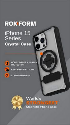
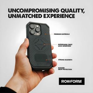
This square product feature template is built for a rugged magnetic phone case and mount ecosystem. The design uses a clean light-gray background with a large, high-contrast black headline (“Uncomprom...
Free for 7 days — Cancel anytime
About This Template
This square product feature template is built for a rugged magnetic phone case and mount ecosystem. The design uses a clean light-gray background with a large, high-contrast black headline (“Uncompromising Quality, Unmatched Experience”) that immediately frames the offer as premium and dependable. Center-left, a hand-held phone case product shot anchors attention, while thin orange pointer lines connect to four callouts on the right—Premium Materials, Integrated Twist Lock Mounting, Strong Magnets, and Rugged Drop Protection—making benefits scannable in seconds. The typography is bold, condensed, and industrial, reinforcing durability and engineering. This structure fits mid‑funnel consideration: the audience is already product-aware and now comparing options, so the template focuses on proof points and convenience rather than hype. It leverages psychological triggers of quality, toughness, and ease-of-use through clear feature labeling. Brands can customize by swapping the case image, updating the four callouts to match proprietary tech, and replacing the bottom-right logo block with their own mark and CTA button while keeping the orange accent for technical emphasis.