Weight Loss Supplement After Comparison Ad Template - Square
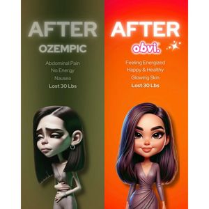
This square weight-loss creative is built as a bold “after vs after” comparison to spark curiosity and debate in the first seconds of scrolling. The layout is a clean split-screen: a muted olive/green...
Free for 7 days — Cancel anytime
About This Template
This square weight-loss creative is built as a bold “after vs after” comparison to spark curiosity and debate in the first seconds of scrolling. The layout is a clean split-screen: a muted olive/green left panel with a sad, low-energy illustrated woman, and a vibrant orange right panel with a confident, glowing illustrated woman. Large, all-caps typography (“AFTER”) anchors both sides, while short bullet-style lines list outcomes (pain/low energy vs energized/healthy/glowing skin) and a shared result claim (“Lost 30 Lbs”). The high-contrast color shift and facial expression change create instant transformation framing, ideal for TOF awareness when audiences are solution-aware and scanning for a compelling alternative. The template works because it reduces complex benefits into quick, readable cues and uses a stylized character to keep the message approachable. Brands can customize by swapping the product name area with their supplement brand, replacing bullet points with compliant benefit language, and adjusting the accent colors to match packaging while keeping the left-muted/right-bright contrast intact.