Brain Supplement Detox Switch Ad Template - Square
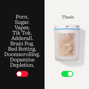
This square ad template promotes a cognitive “clarity” brain supplement using a striking split-screen contrast. The left half is matte black with a stacked list of modern dopamine drains (doomscrollin...
Free for 7 days — Cancel anytime
About This Template
This square ad template promotes a cognitive “clarity” brain supplement using a striking split-screen contrast. The left half is matte black with a stacked list of modern dopamine drains (doomscrolling, sugar, vapes, brain fog) set in a refined serif type, ending with a bold red “toggle off” switch. The right half flips to a clean off-white panel with the headline “Thesis,” a centered pill organizer-style supplement container labeled “Clarity,” and a bright green “toggle on” switch—visually framing the product as the healthier replacement. The strategy is pure TOF awareness for an audience that may not be actively shopping supplements: it leverages curiosity, pattern interruption, and transformation (turn bad habits off, turn clarity on). The minimal palette and editorial typography make it feel premium and trustworthy, while the toggle metaphor communicates the benefit instantly without heavy claims. Brands can customize by swapping the habit list with niche pain points, changing the product name, and aligning the toggle colors to brand accents while keeping the black/white split for maximum contrast and scroll-stopping impact.


