Testosterone Support Supplement Comparison Ad Template - Square
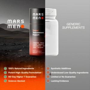
This square ad template is built for men’s performance supplements, spotlighting a “Natural Testosterone Support” bottle versus a generic competitor. The design uses a dramatic split-screen comparison...
Free for 7 days — Cancel anytime
About This Template
This square ad template is built for men’s performance supplements, spotlighting a “Natural Testosterone Support” bottle versus a generic competitor. The design uses a dramatic split-screen comparison: the left side features a branded black bottle with a warm red-to-orange glow set against a dark, Mars-like landscape, while the right side stays minimal with a grey background and an unbranded white bottle labeled “Generic Supplements.” A checklist at the bottom reinforces the product’s advantages with green check icons (100% natural ingredients, potent formulation, 90‑day guarantee, science-backed) contrasted by red X icons calling out competitor weaknesses (synthetic additives, underdosed ingredients, limited guarantee, lacking evidence). This approach fits mid-funnel consideration for solution-aware buyers who already want testosterone support but need a reason to choose one formula. The authority/trust triggers come from the “science-backed” claim, the ingredient callouts, and the guarantee framing. Brands can easily swap bottle renders, replace the claims with compliant benefit proof points, and adjust accent colors while keeping the high-contrast comparison structure that drives decisive scrolling stops.


