Greens Gummies Fiber Support Ad Template - Square
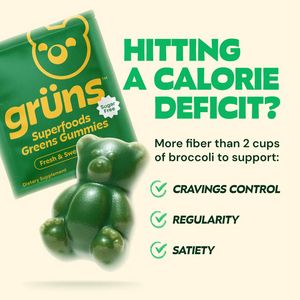
This square supplement ad template is built for a greens gummy product positioned as an easy, sugar-free way to add fiber while dieting. The layout uses a strong left-to-right hierarchy: a tilted prod...
Free for 7 days — Cancel anytime
About This Template
This square supplement ad template is built for a greens gummy product positioned as an easy, sugar-free way to add fiber while dieting. The layout uses a strong left-to-right hierarchy: a tilted product pack shot on the left and a large, bold headline on the right (“HITTING A CALORIE DEFICIT?”) that instantly qualifies solution-aware shoppers. A creamy off‑white background keeps the canvas clean, while saturated greens and yellow accents create a fresh “superfoods” association and high shelf-like visibility in feeds. Beneath the headline, a quantified comparison claim (“More fiber than 2 cups of broccoli”) functions as a credibility anchor, followed by a checklist of benefits—cravings control, regularity, satiety—designed for mid‑funnel consideration where users want reasons to believe before clicking. The gummy bear hero image adds curiosity and approachability, making health goals feel convenient rather than restrictive. Customize by swapping the comparison metric, adjusting the three benefit bullets to your formula (probiotics, digestion, energy), and replacing the pack shot with your brand’s pouch or bottle while keeping the bold headline structure for rapid scanning.


