Daily Multivitamin Convenience Ad Template - Square
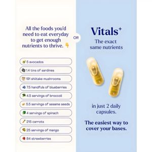
This square supplement ad template sells a daily multivitamin-style capsule by contrasting “what you’d need to eat” with a simpler alternative. The layout is a clean split-screen: a warm off‑white pan...
Free for 7 days — Cancel anytime
About This Template
This square supplement ad template sells a daily multivitamin-style capsule by contrasting “what you’d need to eat” with a simpler alternative. The layout is a clean split-screen: a warm off‑white panel on the left lists exaggerated quantities of foods (avocados, sardines, shiitake, blueberries, broccoli, sesame, spinach, carrots, mango, strawberries) inside rounded pill-shaped rows with small food icons, while the right panel uses a calm light‑blue background, a bold serif headline, and two glossy golden capsules as the hero visual. The “OR” notch between panels makes the comparison instant and intuitive. Strategically, this is MOF consideration for solution-aware audiences: it validates the problem (dietary completeness is hard) and offers a frictionless solution (“in just 2 daily capsules”). Triggers of convenience, simplicity, and health aspiration are reinforced through minimal design, high readability, and quantified proof. Brands can customize by swapping the food list to match their formula claims, updating capsule imagery to their product, and inserting brand colors while keeping the strong contrast and structured list format that drives quick scanning on social feeds.


