Longevity Powder Comparison Ad Template - Square
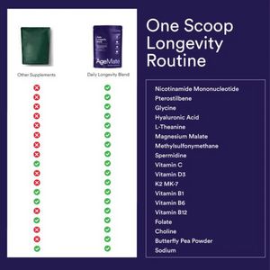
This square supplement ad template is built for a powder “daily longevity blend” and uses a clean comparison layout to simplify a complex formula. The canvas is split: a white left panel shows two pro...
Free for 7 days — Cancel anytime
About This Template
This square supplement ad template is built for a powder “daily longevity blend” and uses a clean comparison layout to simplify a complex formula. The canvas is split: a white left panel shows two product pouches (“Other Supplements” vs “Daily Longevity Blend”) with vertical rows of red Xs and green checkmarks, instantly communicating what competitors lack. The deep indigo right panel carries a large, minimal headline (“One Scoop Longevity Routine”) and a framed ingredient list, reinforcing breadth and completeness. The design relies on high-contrast colors (white vs midnight purple) and a modern sans-serif hierarchy: oversized headline for quick scanning, then a detailed list for credibility. Psychologically, it combines comparison and efficacy (checkmark proof) with convenience (“one scoop”)—ideal for mid-funnel, solution-aware audiences weighing options. It works especially well for shoppers who want fewer bottles and a more streamlined routine. Brands can customize by swapping the product shots, adjusting the check/X rows to match real claims, and replacing the ingredient panel with clinically relevant actives, certifications, or dosage callouts while keeping the strong split structure intact.


