Energy Powder Coffee Alternative Ad Template - Square
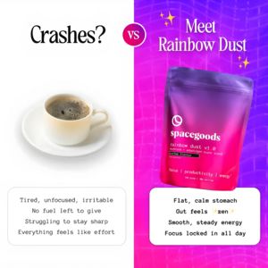
This square supplement ad template uses a clear “coffee crashes vs” comparison to position an energy powder as a smoother alternative. The layout is split vertically: a clean white left side with a si...
Free for 7 days — Cancel anytime
About This Template
This square supplement ad template uses a clear “coffee crashes vs” comparison to position an energy powder as a smoother alternative. The layout is split vertically: a clean white left side with a simple coffee cup and the single-word hook “Crashes?” contrasted against a vivid purple‑to‑pink gradient right side featuring a large stand-up pouch product shot. A circular “VS” badge reinforces the head-to-head framing, while two rounded text cards list pain symptoms on the left (tired, unfocused, irritable) and benefits on the right (flat, calm stomach; smooth, steady energy; all-day focus). Elegant serif headlines plus typewriter-style body text create a modern, editorial feel that still reads fast in-feed. Strategically, it leverages curiosity and transformation, ideal for mid‑funnel consideration among solution‑aware shoppers who already want better energy and are evaluating alternatives to coffee. The concrete symptom/benefit bullets make the value proposition instantly scannable. Customize by swapping the pouch mockup, gradient brand palette, and benefit bullets (e.g., “no jitters,” “no sugar,” “adaptogens”) to match your formula and compliance requirements.


