Liquid Supplement Month 1 vs 6 Ad Template - Square
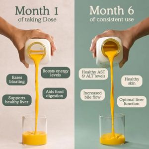
This square supplement ad template uses a clear month-by-month comparison to sell a liquid wellness “dose” through visible routine and outcome framing. The layout is a split-screen: Month 1 on a warm ...
Free for 7 days — Cancel anytime
About This Template
This square supplement ad template uses a clear month-by-month comparison to sell a liquid wellness “dose” through visible routine and outcome framing. The layout is a split-screen: Month 1 on a warm beige background and Month 6 on a cool sage/teal background, each showing a hand pouring a thick golden liquid from a white bottle into a glass. Benefit callouts sit in rounded pill shapes—darker green on the left, light cream on the right—creating an easy scan path while reinforcing progression. Serif headlines at the top (“Month 1…/Month 6…”) anchor the narrative and make the transformation claim feel structured and measurable. Strategically, it’s built for mid-funnel consideration and solution-aware audiences: it doesn’t explain the category from scratch; it validates the choice with a time horizon and specific, health-adjacent outcomes (energy, digestion, liver support, AST/ALT, skin). Curiosity and aspiration drive engagement, while the side-by-side format reduces perceived risk by setting expectations. Brands can swap the month labels, adjust benefits to compliant claims, and replace the bottle and background colors to match their identity without losing the strong comparison logic.


